An insight into dynamic street photography and the impact you can add to your images by breaking the established photographic “rules”.
If you have read my street photography posts you will know that I am primarily interested in documenting daily life in a way that tells a story.
I am also interested in dynamic street photography and the impact you can add to your images by breaking the established photographic “rules”.
I’ve instinctively used these techniques in the past but decided I wanted to learn more about this expressive form of street photography.
To this end some friends and I attended a workshop in Brighton by Jerry Webb in January 2020. It was an informative and enjoyable day.
Abstraction, Distortion, Angles and Motion Blur
Firstly Jerry gave us a presentation featuring his own work plus iconic images by famous street photographers. We discussed the techniques used to create dynamism within the images presented.
I am competent with these techniques but it was very informative to learn more about incorporating them into my own work.
Some of the techniques discussed:
Abstraction
In a nutshell abstraction is an image that distorts reality, it really is as simple as that! If done well the viewer will ponder the meaning and content of the image.
Distortion
A simple way to distort an image is to use an ultra wide angle lens and get in really close. This breaks so many rules when photographing people. Conventional wisdom suggests that wide angle lenses deliver unflattering pictures of people. But, done well, I love it!
Angles
This one is simple, vary your angles! Shoot from high and low positions or shoot from the hip. If all your images are made with the camera at eye level they can lack impact and risk becoming “samey”. Mix it up and get funky with your angles!
Motion Blur
This is a favourite technique of mine, incorporating motion blur by using a slow shutter speed. If you are in control of your camera you can achieve both blurred and sharp elements within your image. Alternatively you can blur the whole image to achieve an abstract image.
The One Hour Challenge
After Jerry’s presentation and lunch it was time to get hands on. We were given just over an hour to wander around Brighton city centre with our cameras and put everything we had just learnt into practice.
Jerry gave us a list of subjects to target and it was down to us to employ the techniques discussed.
It was quite a challenge to get “in the zone” with just an hour to shoot but I do like a challenge and I enjoyed the photo walk.
Five Images and a Critique
Jerry invited each of us to submit five images for a written critique after we had processed our “keepers” from the day.
I think critiquing is an important part of photography, both in terms of receiving feedback from others and in learning how to objectively critique our own work.
This is how we evolve and improve as photographers. I have known Jerry for a few months now and I regard him to be a first rate photographer and a constructive and insightful critic.
Here are my five “keeper” images from the photo walk, Jerry’s critique and my thoughts on each one:
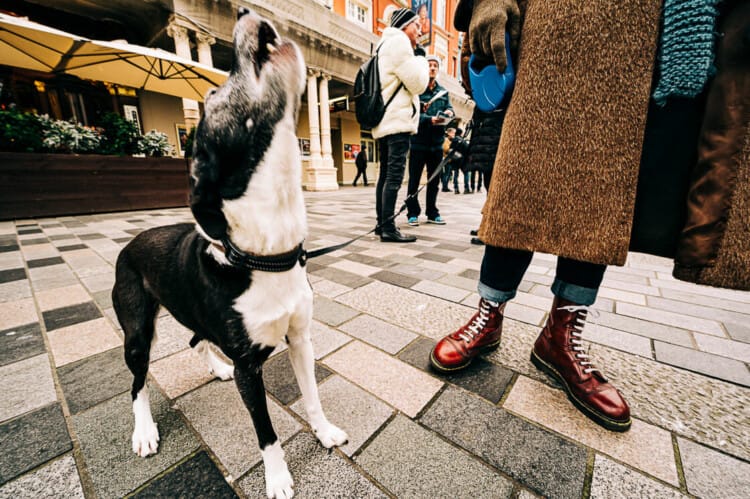
1. Howler and the Docs
Jerry’s critique:
“What’s not to like, great dynamics, energy and composition with lines running from the centre to the edges, dog is in mid-howl you can almost hear it. It really works looking downwards with the bloke (I think) with his head cropped out – it’s all about the dog and the Docs. Other people are good for context but relatively unimportant. Works well in mono as well because of the strong shapes and line of legs in the centre of the image, but in the end colour sits better. Good palette, browns and reds emphasising the importance of those polished docs…Great picture.“
My thoughts:
This is my favourite image of the session and I also prefer the colour version because of those polished Dr Martens. (Mono version excluded from this post). I got down at street level with an ultra wide angle lens for this one.
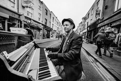
2. Piano Player in the Road

Jerry’s critique:
“Good mono pic, really works well – shades of 1960’s with old piano and hat contrasted with phone on the piano and the clearly modern women and girls. The bright white sky would ruin the colour version. Perfect composition, with the piano player so dominant, isolated against the paler background with his dark jacket and head nestled in the centre of the 4 leading lines. Also like that the piano player is not looking at the camera.”
My thoughts:
Firstly, in how many cities will you see a bloke playing a full size piano in the middle of the road? I love Brighton for this sort of stuff! Secondly, it is the use of an ultra wide angle lens, shot up close, that helps to make this a successful image.
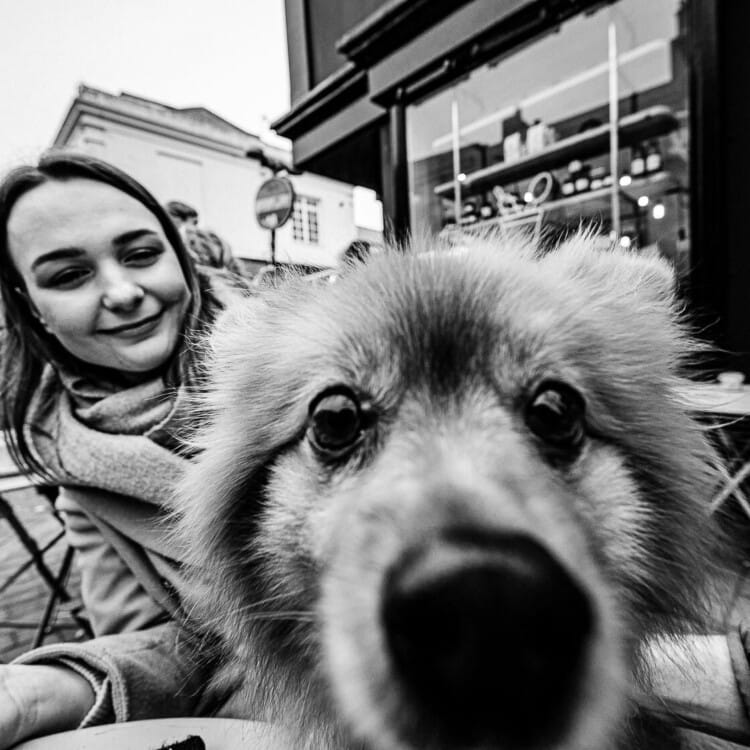
3. Dogs Life
Jerry’s critique:
“Dog completely filling the frame works, there is no doubt who is the star of the show and there is something comedic about it’s expression. Probably been better if the dog was in focus and not the woman, her expression is not as interesting but it still works well and was probably a snatched shot.”
My thoughts:
I agree with you Jerry, the dog is the star of the show and there is definitely a comedic element to this image. This was shot at 14mm with the dogs nose about an inch from the lens. The lens is incapable of focussing this close, but it still seems to work, despite not being sharp. I also learnt that if you ask to take a picture of somebodies dog they almost always say yes!
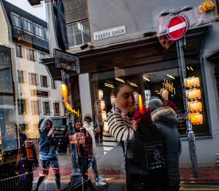
4. No Entry
Jerry’s critique:
“I do like this. For me the confusion and the chaos of the window is what works. Those in the shop interwoven with the street crowd outside provides an image that needs to be digested. Street pics are too often about impact and laughs. Works well in mono. I would crop in or preferably have moved closer in as the exterior is not really necessary for context. There are lots of smaller elements that also work within the image.”
My thoughts:
Jerry critiqued this image exactly as I submitted it to him in monochrome. I have since cropped it in MUCH tighter (he was right) and changed it back to colour. Now you wouldn’t immediately know this is a window reflection without an accompanying explanation. In hindsight colour works best for this image. Colour better highlights the multiple and strange layers within the image. As an abstraction I think it works much better now.
5. Street Busker
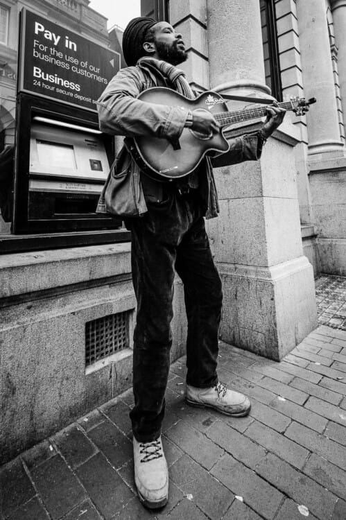
Jerry’s critique:
“To be honest, doesn’t do too much for me. The ‘Pay In’ typography is relevant but a little distracting without seeing his collection pot on the ground. There is nothing that says anything about him really as a street portrait, the POV emphasises his stature but you feel you want to see his face.”
My thoughts:
This image it is the weakest image of my keepers from the session. I still quite like the angle of the shot taken whilst sat on the ground using a wide angle lens. I could do better though! In my defence I had to find five keepers from an hour of shooting time.
Conclusion
I hope you enjoyed reading my take on exploring dynamic street photography. I certainly recommend Jerry Webb’s workshops to anyone local to Brighton who wants to learn more about this genre. Jerry is a very talented photographer and teacher.
I think his workshops are suitable for all levels from beginners through to very experienced photographers.
Criticisms of the workshop? None really. Just an observation. I would have liked a couple hours or more on the streets taking pictures. Don’t we all? One hour seemed a little rushed, but it did add a certain focus and urgency to obtaining our images. Maybe that was a good thing?
Related Topics
You might be interested in more of my photography tutorials and tips here. Alternatively, you can learn more about my work locally as a UK and Brighton street photographer here.
Share this post:

